i have been getting a lot of reader requests that i show some personal projects, which is weird. not weird because people may think i never actually ever do any design work, but weird because people are reading this blog. i thought for a long time that it was just nine of you reading (one of whom is b-rad, who i force into readership because i occasionally (all the time) write about him), but it turns out there are more of you, so thank you! for rillz. thanks for reading this blog, and to ALL BUT ONE OF YOU, thanks for saying really nice things.
anyway, the deal with me posting pictures of projects is this: i work at a small firm, which i don't own. any pictures i have (even the ones i take with my iphone) are technically not mine to share unless we are done trying to get that project published, or if we have already posted them on our company website. while i love this blog and all, i am not about to get fired just so you can see it here first. also, we have a marketing girl in the office who i am totally terrified of and if she busted me using our pictures without permission, she would eat me for lunch like five-day old pizza. LOVE YOU KAREE. but girl you scary.
as for my house, it is always a crack-den mess of cat hair and half-completed everything, so i'm not ready to share anything yet other than photos of steve. THANKFULLY, we have a one-room project underway that is totally safe for me to post. i'm even going to bust out some before and after, so brake yourself. this particular client is in dallas, and she is super awesome. although she has great style and already owns several fantastic pieces of furniture, lauren wanted to add some P-ZAZZ to her dining room/sitting room combo, while still remaining kid- and dog-friendly. so here is the before. look at those tasty herringbone entry floors. also, lauren designed and had that dining table made by herself, people. LIKE. if it would have fit in my suitcase (or in my house), i might have stolen it. (lauren, consider yourself warned). you should see her kitchen.
we pulled some different color palette options for lauren to choose from, based on these inspiration images she sent over. boom. you like where her head's at already, don't you?
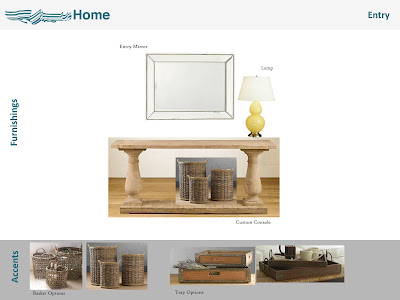
so then, because we are not only amazing designers, but COMPUTER WIZARDS TOO, we made this extremely fancy presentation. see what we did there? with the words, and the pictures? i completely understand if you start comparing me to bill gates or that stammering guy from the facebook. we probably all have asperger's anyway.
so lauren liked it, bada bing bada boom, some minor tweaking and now it looks like this. did you almost die when you saw that slipper chair? ME TOO. you should also know that the fabrics on the dining chairs are indoor/outdoor material, which means they can take a serious scrub-down. it's a great trick we use All. The. Tiiiiime.
thanks for letting me post pictures of your house, lauren! it's an internet first here at the wonders, and those really don't happen that often.


3 comments:
Nice work K! Thanks for 'exposing' yourself.
Super fly transformation!
Love the gold pillers and the chandy ;)
Cheers, Alcira
nerochronicles.com
thanks guys! it's very weird, putting photos of this nature on the ol' blog, and i appreciate the support!
kristina
Post a Comment